Home > Opinion > Visibility of facade advertisements
Facade advertisements, box letters & illuminated letters are all forms of graphic and visual communication. Their application is the way a company communicates its presence, brand and message.
SignDeal offers all the tools to visually create any facade advertising you want and order it easily and transparently.
Facade signs essentially have a fairly simple function: they show where you are! Not only do they help customers find your business, but they also show potential customers that you are there. Looking further, we see that your facade advertising also tells a lot about your business.
A façade advertisement gives customers an important first impression, guiding them to your premises and providing brand recognition and your desired brand experience.
Effective façade advertising involves much more than the display of just a logo. There are many decisions that must be made for successful façade advertising. Consider size, lighting and placement.
SignDeal offers the tools to help you do this quickly and easily. SignDeal is your one-stop facade advertising specialist, completely handling the creation of a successful illuminated advertisement from start to finish.
By offering high quality and eye-catching facade advertising with very high guarantees, SignDeal ensures that your company gets a facade advertisement that you are proud of and stays that way!
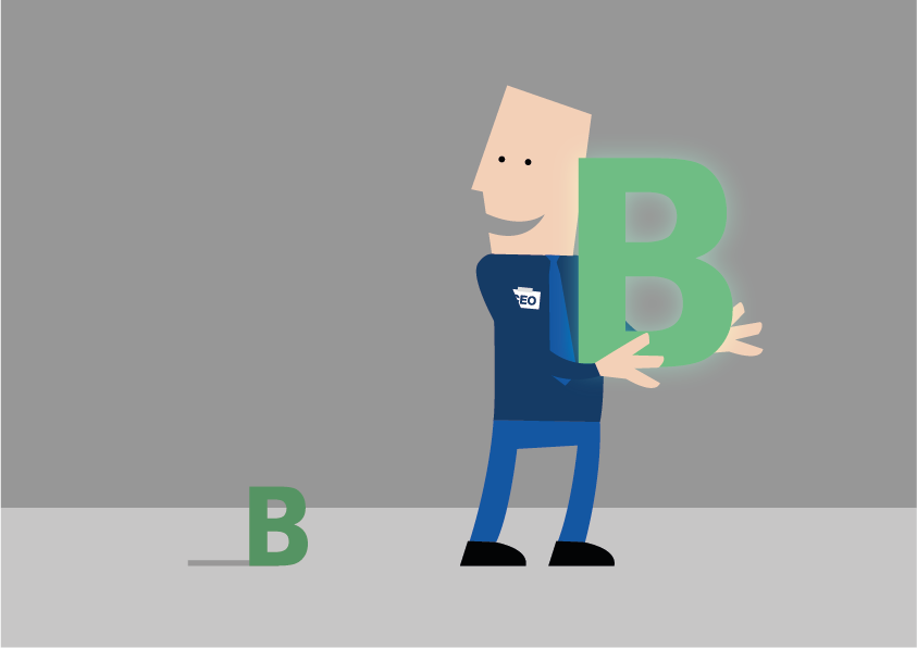
A good facade advertisement, says more than 1,000 words.
More value and more sales in retail
Companies use façade advertising to communicate with customers. And it's a conversation that goes far beyond the fact that shampoo is on sale this week. Consumers learn - and assume - all sorts of things about a company based on its façade advertising.
These observations, through American research, are better understood thanks to the American Shopper Study™ by BrandSpark / Better Homes and Gardens (referred to as the "Shoppers" study). This study offers a wealth of insight into consumer behavior. Dr. James Kellaris of the Lindner Business College, part of the University of Cincinnati conducted an in-depth data analysis of the results, providing very important insights for retailers and façade advertising professionals.
Over the years, these are the key findings: Consumers make assumptions about the quality of a business based on its façade advertisements. Most consumers prefer variety and distinctiveness rather than uniformity.
Façade advertisements that are too small or illegible are seen as a missed opportunity as customers drive by without being able to find a business. More than 9 out of 10 people prefer verbal facade advertising. In other words, this is a facade advertisement in which language is used as a means of communication.
The quality of a façade advertisement has a direct effect on a company's ability to attract customers.
The survey found that more than half (54%) of shoppers, that they have driven by more than once and failed to find a business because the facade advertising was too small or unclear.
Both younger and older people reported this problem. A third of customers said they were drawn to unfamiliar stores based on the quality of their façade advertisements.
Nearly 40% of shoppers say they have made quality assumptions about a business based on the clarity and attractiveness of their façade advertising. Young people between the ages of 18 and 24 are the most likely to make such conclusions.
Indoor and outdoor advertisements are both key methods of informing customers about new products and in many cases are more effective in conveying information than other methods.
Read the full reports of Kellaris' findings: 100,000 shoppers can get it right: signage for BrandSpark communications / Better.
Homes and Gardens American Shopper Study (2011): www.signresearch.org/shoppers2011 Viewing façade advertisements through the eyes of onlookers: perceptual evidence from the American Grocery ShopperSurvey (2014).
How do I increase the visibility and readability of my facade advertising?
Home > Opinion > Visibility of facade advertisements
How well a facade advertisement works for your business depends largely on its legibility or visibility to people driving by or walking by. For optimal readability, a facade advertisement must be detectable, conspicuous, legible and understandable.
Designing an advertisement is about much more than making your logo look good. Things like size, placement and lighting must be in harmony with the location where the sign will be hung. For example, the U.S. study Safety and Human Factors: Design Considerations for On-Premise Commercial Signs found that if a façade advertisement is mounted parallel to the roadway at the front of a building, it must be 70% larger to be read in time than if it is mounted perpendicular to the roadway.
In short, you want your (potential) customer to be able to find you at a glance or read what you want to say. Although it sounds logical, it often goes wrong. Therefore, SignDeal helps you by pointing out the pitfalls.
The top 8 reasons why façade advertisements are hard to see or hard to read:
1. Letters are too small (83%).
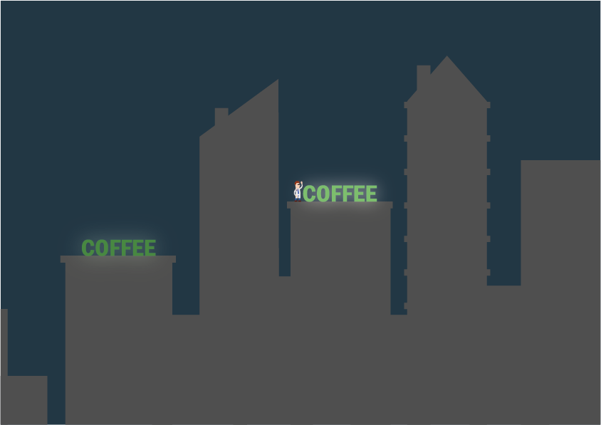
Consider from what distance your facade advertising should be visible to your customer
The ratio of a generally legible letter versus spacing.
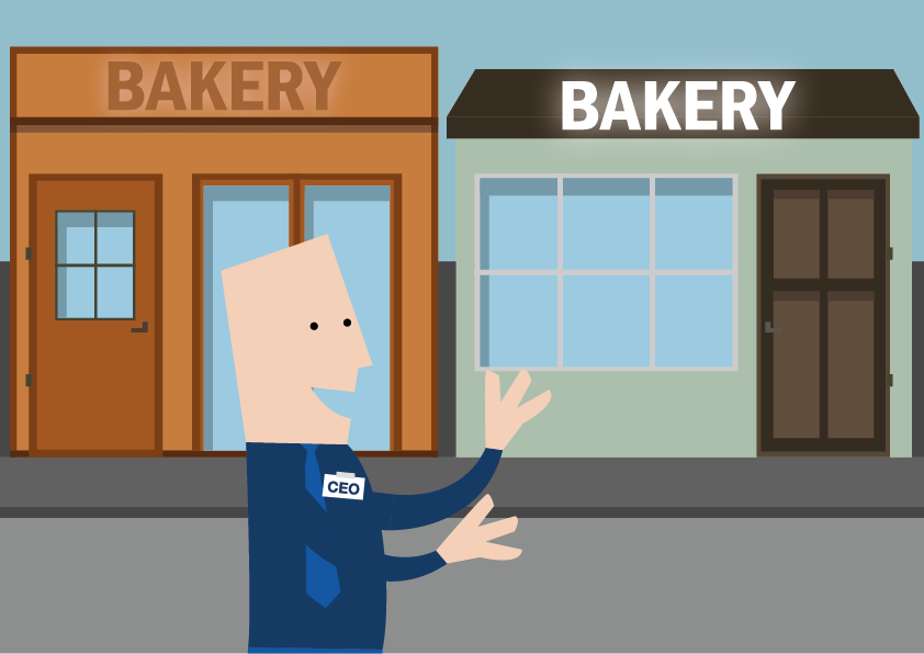
2. Poor placement (71%).
Where does your facade advertising stand out best?
Consider from what distance your advertising should be visible.
Where does your facade advertising stand out best?
3. Insufficient lighting at night (64%).
Consider that for a limited additional cost, you will also be easily findable and visible at night and in winter.
4. Color of letters does not stand out against the background (60%)
Adequate contrast of your facade advertising to the background makes your logo stand out.
We use quality LEDs from Stogger with very low power consumption, high light output and long life, so that your advertising stands out and is optimally visible.
Provide adequate contrast between the color of the facade advertising and the color of the background.
5. Letters in a peculiar font (48%).
If you have a peculiar font, consider a slightly larger logo so that readability is improved.
The better the readability, the clearer the message.
Consider from what distance your advertising should be visible.
6. Letters are placed too close together (36%)
Placing enough distance between individual box letters makes the text more legible.
7. Façade advertising is too similar to other façade advertising in the neighborhood (34%)
Make sure you set yourself apart. This can be done both through distinctive design and by choosing quality lighting so that your facade advertising is always beautifully and clearly lit.
8. It contains too many distracting images (32%)
The more distracting images, the worse your message will be read. Often, “Less is more.” Make sure you are clear what message you want to convey.
Ready for takeoff?
If you would like information about what we can do for you, please contact us now contact up! If you want to see what facade advertising will look like at your place, use our matching tool now and request a sample immediately.
To provide the best experience, we use technologies such as cookies to store and/or access information about your device. Consenting to these technologies allows us to process data such as browsing habits, company recognition and unique IDs on this site. If you do not consent or withdraw your consent, certain features and capabilities may be adversely affected.
Functional
Always active
The technical storage or access is strictly necessary for the legitimate purpose of enabling the use of a specific service expressly requested by the subscriber or user, or for the sole purpose of carrying out the transmission of a communication over an electronic communications network.
Preferences
The technical storage or access is necessary for the legitimate purpose of storing preferences not requested by the subscriber or user.
Statistics
Technical storage or access used exclusively for statistical purposes.Technical storage or access used solely for anonymous statistical purposes. Without subpoena, voluntary compliance by your Internet Service Provider, or additional data from a third party, information stored or retrieved solely for this purpose typically cannot be used to identify you.
Marketing
The technical storage or access is necessary to establish user profiles for sending advertising, or to track the user on a site or across sites for similar marketing purposes.